

Most homeowners choose plants based on what looks good at the garden center. However, the secret to a “magazine-worthy” front yard isn’t just buying beautiful plants—it’s understanding how those colors interact with the “permanent” colors of your home’s siding, shutters, and front door.
By treating your front yard like a canvas and applying basic color theory, you can create a high-impact entrance that feels intentional, balanced, and expensive.
1. Finding Your “Base Layer”: Matching Your Home’s Palette
The “canvas” for your garden is your house. Before you buy a single flat of flowers, identify the undertones of your home:
-
Warm Tones (Beige, Red Brick, Cream): These homes pair beautifully with “Sunset” palettes—deep oranges, yellows, and rich reds.
-
Cool Tones (Grey, Blue, White, Slate): These homes shine when surrounded by “Jewel” tones—purples, silvers, cool pinks, and crisp whites.
-
Natural Textures (Stone, Wood): These “earthy” exteriors benefit from a high-contrast green palette. Focus on varying the texture of the greenery (glossy vs. matte) rather than just adding floral color.
2. Using the “Rule of Three” (Color Proportion)
In professional design, we often use the 60-30-10 Rule to ensure a space doesn’t feel chaotic:
-
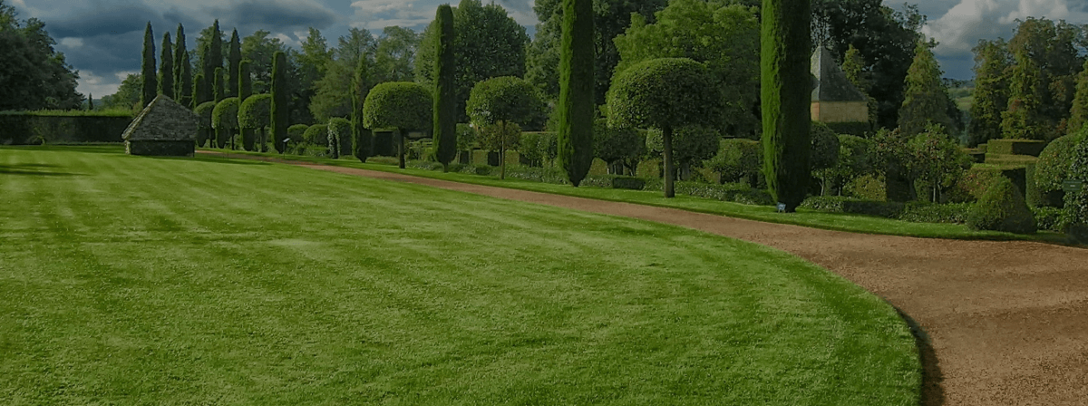
60% Dominant Color (Green): This is your foundation. Use evergreen shrubs and lawn to provide a consistent “background” that keeps the garden looking lush year-round.
-
30% Secondary Color: Choose a color that complements your home. If you have a grey house, this might be a sea of purple Lavender or Catmint.
-
10% Accent Color (The “Pop”): This is your front door color or a specific high-contrast flower (like bright red Geraniums). This small splash of color draws the eye exactly where you want it: the entrance.
3. Creating Visual Depth with Complementary Colors
To make a small front yard feel larger and more vibrant, use Complementary Colors (colors opposite each other on the color wheel). These pairings create an optical “vibration” that makes the garden look more energetic.
-
Purple & Yellow: Pair “Walker’s Low” Nepeta (purple) with “Moonbeam” Coreopsis (yellow). The yellow makes the purple look deeper, while the purple makes the yellow glow.
-
Blue & Orange: Try blue-toned Hostas or Hydrangeas against the fiery orange-red foliage of a Japanese Maple.
-
Red & Green: This is nature’s classic. Red roses against a dark green boxwood hedge provide a timeless, high-contrast look that screams “curb appeal.”
4. The “Golden Hour” Test: Lighting and Saturation
Color looks different at 8:00 AM than it does at 6:00 PM.
-
Bright Sun: In full, direct sun, pastel colors (like light pink or pale blue) often look “washed out.” Use highly saturated, bold colors like magenta, gold, and deep red for south-facing yards.
-
Shade: In the shadows of a porch or large trees, dark colors (like deep purple) disappear. Use white, chartreuse (lime green), and variegated foliage to “light up” dark corners.